

Bad Design Blindness
Mental model behavior

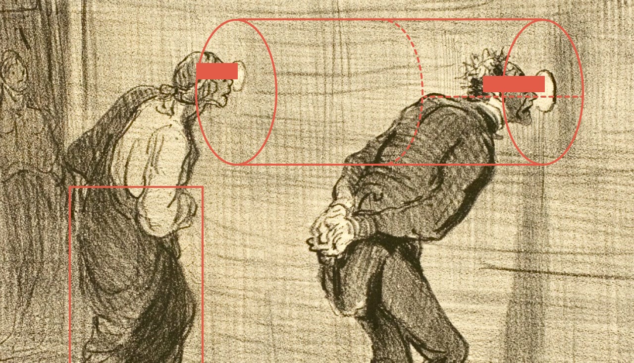
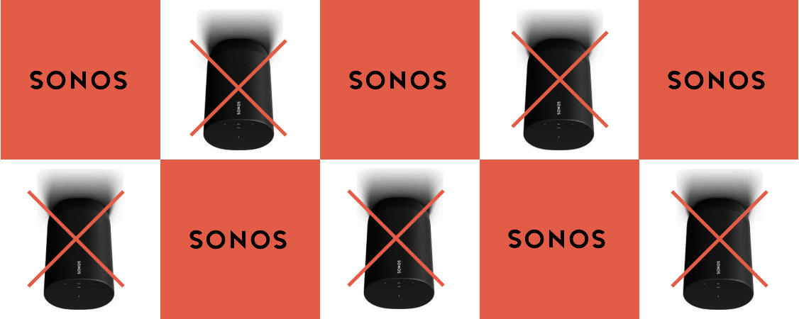
My Sonos app has been pissing me off for months. Maybe a year. Maybe a decade. Who knows—time is a fatigue-filled illusion when you’ve got a three-year-old. At some point the CEO made a sad little video about their “commitment to quality.” Then he resigned. The app is still mediocre. We’re all supposed to accept this half-functional music experience as the price of admission.
On Reddit, Sonos users are foaming at the mouth. It’s so obviously broken that even casuals notice. But the thing is with most apps, the general public just shrugs. They don’t see “bad.” They don’t say, “Wow, this UI is an abomination.” They just… adapt.
Why? Three reasons:
Mental models create design blindness.
Brand shine distorts perception.
Most people don’t consciously care about taste.
1. Mental models = design autopilot
A mental model is basically the shortcut your brain builds to get something done. Cliff Kuang calls them “the intuitions we have about how something works.”
After decades of Netflix, Hulu, Disney+, Max, we all know the drill: open app, scroll tiles, hit play. That pattern is a neural highway. Our brains lock in.
And once you’re on autopilot, you stop seeing the ugly. You don’t notice bad typography, broken flows, or confusing menus—you just stumble through while texting, eating, wrangling your dog. Designers may scream into the void, but regular people are already watching the show.
2. Brand shine = design forgiveness
If the brand makes you feel good, it papers over a lot of sins. Smooth logos, tasteful gradients, well-chosen fonts—suddenly the clunky sign-up flow doesn’t sting.
Path was beautiful, if pointless. Uber was polished long before it was reliable. Spotify Wrapped is basically a magic trick: distract you with neon nostalgia while the core experience keeps limping along. The brand halo lets people forgive and forget.
3. Taste is a luxury, not a baseline
Most people don’t interrogate their own sense of taste. Sure, Instagram floods us with perfect interiors and handmade ceramics, but capitalism floods us with Dollar Store garbage too. Brains can’t keep up.
So companies cheat. They copy-paste the look of good design. It’s often enough.
Take Slack: a Pentagram logo, easy chat, smooth file sharing—but try finding one conversation in a thousand channels. Good luck. Goodreads? A fossil. But it works “okay,” and switching is a pain. That’s enough.
We care about taste when we pick shoes or a restaurant. We rarely care when we pick an app.
The bottom line
Most people just want software to work. Mental models carry them through garbage flows. Brands keep them dazzled. Taste doesn’t matter. Unless the design is catastrophic, like Sonos, people adapt. They live with it.
That’s bad design blindness, but I hope you see my point.
I finally had to move from Spotify to Apple Music because I just didn't like the way Spotify looked and I want music to make me happy.
Well said, Mike — I agree with you on all counts. It's good to hear from you!